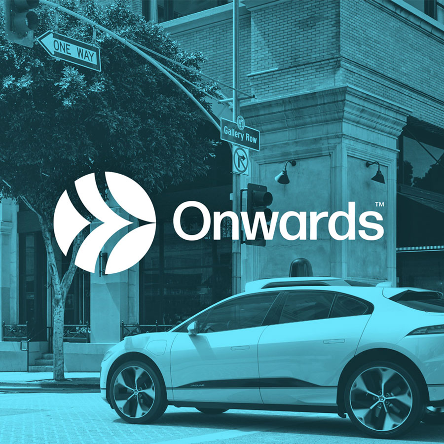
Onwards is an eco-friendly tech company that creates self-driving equipment for electric cars. Their vision is to create a carbon-neutral atmosphere, all while boosting productivity and getting you from A to B.

With no existing identity, the client needed a clean, minimal visual brand that clearly reflected their eco-friendly tech business. It had to communicate their values while feeling modern, professional, and built on a strong foundation for future growth.


After learning more about Onward, we knew their identity should reflect the sleek, minimal design of their products. Like many eco-friendly products, they are stripped back to the essentials, designed with purpose and simplicity—an approach that felt perfect for Onward’s visual identity. Keeping the visuals minimal also lays a strong foundation for the brand to evolve as the company grows and refines its vision of who they are and who they want to reach.

A minimal, reflective icon that embodies the brand's vision and personality. Crafted with three storytelling elements—Motion, Movement, and Vision—to create a symmetrical logo that enhances brand recognition.


